TABLE OF CONTENTS
System Wide Common Terminology and Layouts
Throughout this document, pages are introduced followed by panels available on the page. Generally, the areas of the screen are made up of the following sections.
The general description for the page or panel may include a navigation path through the OR MMIS application to the panel. For example:
Navigation Path: [Provider - Search] - [select row from search results] - [Dispensing Fee]
This example describes at a high level the actions that a user would follow to display the Dispensing Fee panel in the Provider subsystem. To provide more detail for the user in a step by step format, the View step, action, and response table follows the general description. Other step by step procedures accompany the View table. The table types are identified in the Panel Type and Functions section of this deliverable.
The panel picture displayed for the layout is a snap shot of the panel from the OR MMIS application. Data displayed is typically testing information.
Field descriptions provide details about the fields that occur on a panel. The Field column lists the field name, and if it appears more than once, where the field occurs on the panel,. For multiple locations, a field name specifies the following panel locations:
· List The field displays as a column header in a search results list.
· Detail The field displays as a single item from the chosen search results list.
A description of the field follows with its length, data type, and if appropriate, panel calculation. The Calculation column describes the formula used by the OR MMIS to determine the value of a field.
The field edits Field column identifies the fields on the panel in the same manner as the Field Descriptions table. Messages which the user may encounter when entering information list in the table with a recommended corrective action.
Report descriptions appear in this manual with field descriptions following the page and panel information. The field descriptions for the reports follow the same methods used for the pages and panels.
OR MMIS users should find the table of contents at the beginning of this document most useful when trying to locate the description of a specific page, panel, or report. If you are a first time user, study the table of contents to get the most complete view of the functions the OR MMIS supports. Refer to the 3.1.b Desk Level Business Processes document for a complete list of the business processes that DHS staff carries out using the OR MMIS.
Double-click the OR MMIS icon on your desktop to display the application log on window.
Type your user ID and password and click OK to display the application's Main Menu.
Click Exit Application on the Main Menu to log off the application.
The OR MMIS displays within Web browser pages that fit on a computer (PC) desktop with a screen resolution of 1024 x 768 pixels. However, to fit large system objects such as panels, pages, reports, and letters into one screen print, the user has the option of resetting the text size of the Web browser so that the selected area of the system fits into a screen print.
In addition, there may be some Web browser pages that use a lower pixel configuration and cause a horizontal scroll bar to appear at the bottom of the page for viewing the left side and the right side of the information displayed. In general, pages should only require vertical scrolling.
To set system text size, perform the following steps:
|
Step |
Action |
Response |
|
1 |
Log on to the OR MMIS |
Home page displays. |
|
2 |
Select View. |
View menu displays. |
|
3 |
Point to Text Size and click Smaller. |
Default text size is set to medium. After the user selects smaller, the system objects appear smaller. |
System Wide Common Terminology and Layouts
The following section identifies common system terminology and features, and where applicable, an associated panel layout. This is not an all-inclusive list of common system terms and layouts; however, it is a basic foundation for the beginning user to view and understand prior to navigating the system. These terms will be used by technical team members, training specialists, and help desk staff when discussing or more importantly, documenting, aspects of the system.
For information about system wide objects, instead of clicking a subsystem link within the technical design page, the user clicks the System Wide link to open documentation of system objects which are common system wide within the application.
Below is a partial list of common terms which will be described within this document:
§ Page
§ Page Header
§ Page Footer
§ Submenu
§ Shortcut Keys (ctrl + alt + letter)
§ Main Menu bar
§ Panel
§ Advanced Search
§ Mini Search panel
§ Hot Link
§ Information panel
§ Navigation panel
§ Task List panel
§ Title Bar Icons
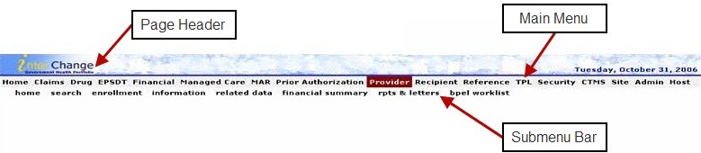
A page is defined as the entire screen that appears in the Web browser. The page contains a page header area with the day and date displayed, a Main Menu bar, a Submenu, and any associated panels. The bottom of the page contains the page footer with the EDS copyright text displayed.
The main menu bar contains a horizontal set of links which display pull-down menus. Each pull-down menu opens an associated page within the system.
Beneath the main menu bar is the submenu of horizontal links that open an associated page within the system. The submenu links appear in the same order as the main menu pull-down options, and the submenu links are spelled the same as the main menu pull-down options.
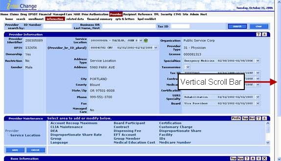
In general, when navigating a page, the vertical scroll bar should be the only scroll bar needed to view panels stacked in a vertical manner.
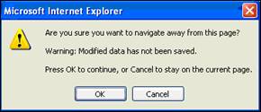
If a user attempts to add, update, or delete information within the page, then prior to navigating away from the page, the system prompts the user with a pop-up modal window message. When the system generates the message, the detail panels will be locked open, and navigation away from the page is not be permitted until changes are either correctly saved or cancelled.
Shortcut Keys
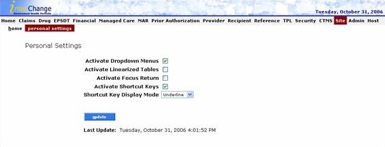
If the user activates the shortcut keys function, the Sub Menu links can be used in combination with (Ctrl +Alt + focus key) to quickly open the associated page.
To activate the shortcut key, click on the Site link, check Activate Shortcut Keys and click the Update button.
To know which letter to use in combination with the (Ctrl + Alt) shortcut keys, the user must look at the submenu name. Within the name, the letter that has a horizontal bar above and below it is the shortcut key letter.
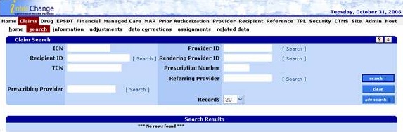
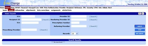
Within the Claims submenu, the user can use the shortcut keys to quickly navigate from the Claims Search panel to the Data Corrections panel by using the following shortcut key combination: (Ctrl + Alt + O) since the letter O is found within the horizontal bars on the submenu adjustment link.
There are several search options available within the OR MMIS including: Search, Advanced Search, Mini Search and Pop Up Search panels.
Some subsystems such as the provider data maintenance subsystem contain a search panel without an advanced search button included on the panel.
Search results can be sorted in ascending  or
descending
or
descending  order by clicking
the column name in the Search Results panel. All search results refresh
the sort order, not just the search results displayed on the current search
result panel.
order by clicking
the column name in the Search Results panel. All search results refresh
the sort order, not just the search results displayed on the current search
result panel.
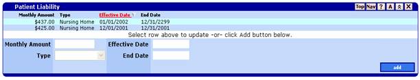
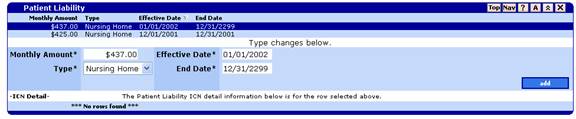
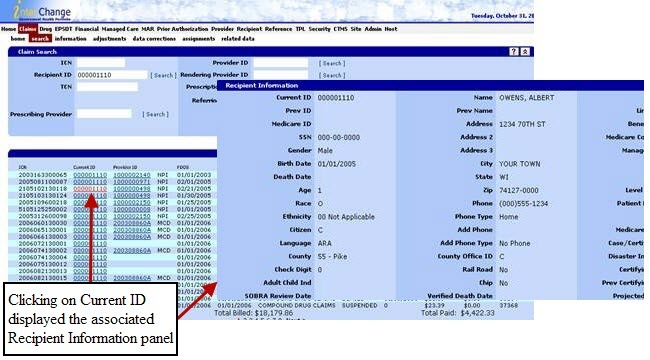
If the user clicks once on a search result row, the associated information panel opens. In the following figure, the user clicks the first row of the Recipient Patient Liability panel and detailed information displays at the bottom of the panel.
After the user has viewed at least one search result in an information panel, another search can be completed by using the primary search fields within the Mini Search panel located above the information panel containing the search result.
Mini Search panels contain one or two primary search fields related to the business process.
A Pop Up Search panel allows the user to search for field data without leaving the page. By clicking on the Search link, the system displays the search panel that is associated with that particular field.
Within certain search panels, the user can also click hot links to see additional information. If the fields in a column are underlined, there is a hot link available.
A panel is defined as a portion of a page that performs a specific function. Some panels always appear on a page, while others only appear when invoked by the user.
The system contains various panel types with specific functions for each panel type. A function for a panel describes what actions a user can perform on the panel. Step, action, and response tables describe the process for available panel functions. These tables describe the following possible panel functions:
|
Function |
Description |
|
View |
How to display the panel. |
|
Add |
How to add information on the panel. |
|
Update |
How to update information on the panel. |
|
Delete |
How to delete information on the panel. |
|
Explore |
How to view information on the panel if the add, update, or delete functions do not apply. |
Some panels have common icons while other panels have icons specific to their functions. Listed below are icons that can be found on one or more types of panels:
|
Name |
Icon |
Description |
|
Add Button |
|
Inserts a new data record. |
|
Delete Button |
|
Deletes a selected data record. |
|
Cancel Button |
|
Cancels all changes applied to all panels on the page. Can be found on the navigation panel. |
|
Save Button |
|
Saves all changes to all panels on the page. If validation errors occur, an error message displays in the task list panel. Can be found on the navigation panel. |
|
Maintain Button |
|
Maintains a selected data record. |
|
Preferences Button |
|
Displays a checkmark box next to each navigator item link. By checking the box, the link automatically opens whenever the user browses the page. To hide the boxes, click on the button a second time. Can be found only on the Navigation panel. |
|
Top Button |
|
Allows user to jump to the top of the page. |
|
Bottom Button |
|
Allows user to jump to the bottom of the page. |
|
Help Button |
|
Opens a window that displays the panel Help page. |
|
Maximize Button |
|
Expands a panel to display all of its content. |
|
Minimize Button |
|
Collapses a panel. |
|
Navigation Button |
|
Jumps to the navigation panel. |
|
Audit History Button |
|
Opens the audit history panel for a specific panel. |
|
Close Button |
|
Closes a panel. |
|
Green Information Button |
|
Opens information file, or new browser window, for the associated field. |
Among the panel types are the following:
- Maintenance panel
- Task list panel
- Maintenance item panel
- Audit panel
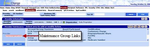
A maintenance panel is a special control panel that uses links to open or close panels on a Web page. By clicking on a maintenance group link, the associated maintenance item panel displays. Changes to maintenance items displayed on the page are saved or cancelled by clicking the Save or Cancel buttons on the maintenance panel.
The maintenance panel is used to navigate within a page, never to leave the page.
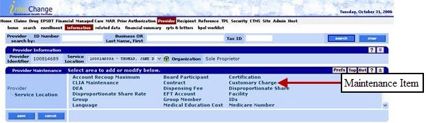
The following image demonstrates maintenance group links (Provider and Service Location) and the associated maintenance item links.
By clicking on a Maintenance Item Link (such as Contract), the associated panel opens.
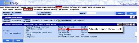
Results: Contract panel displays.
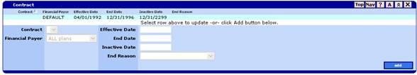
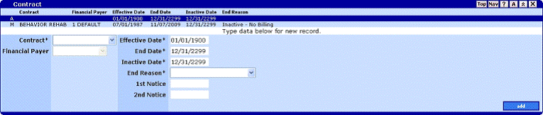
An indicator will display at the beginning of the line when a row is added (A), data is modified (M), or if a row is marked for deletion (D).
Task List panels appear within navigation panels and provide messages to the user regarding whether the data was successfully saved, or if errors occurred to prevent the data from being successfully saved, or warning messages which may or may not include a radio button selection for the user to activate prior to completing the task.
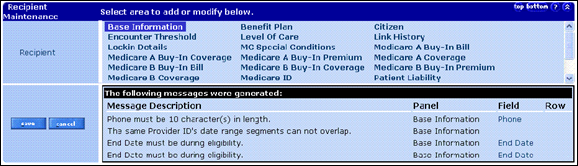
The task list contains the name of the panel where the error occurred, and the field name or row to help users quickly identify key areas to correct prior to attempting another save action.
Warning messages provide users with a warning about the data they are trying to update, delete, add, or save. For example, if the user attempts to add a duplicate record, the system generates a warning message.
An error message can also contain additional information which is accessed by clicking on a square node icon in the lower left side of the task list panel.
Open a maintenance item panel by clicking a link on the maintenance panel. Maintenance items allow detail data to be viewed and updated. Usually a maintenance item has a list of data records and a panel to perform data updates. Click the Add button to enter a new data record, or click a data record from the list to perform field updates or to delete the record. Once selected, delete a data record by clicking the Delete button. All adds, deletes and updates must be followed by clicking the Save button before the transaction is permanent.
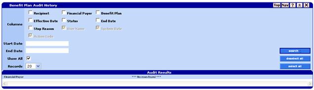
Audit panels display data change history for a given navigator item panel. Every insert, update or delete that is performed (on an updatable panel) in the system causes a before image of the data to be saved to the audit table. Users can then use the audit panel to display this information.
Audit panels are opened by clicking the  button
in the navigator item panel.
button
in the navigator item panel.
The following hot keys manipulate the Web browser functions.
|
Windows Reserved Action |
Hot Key |
|
Back |
Alt+Left Arrow |
|
Close Window |
Ctrl+F4 |
|
Edit |
Alt+E |
|
Favorites |
Alt+A |
|
File |
Alt+F |
|
Forward |
Alt+Right Arrow |
|
Full Screen |
F11 |
|
Help |
Alt+H |
|
Home |
Alt+Home |
|
Refresh |
F5 |
|
Select Location Bar |
Alt+D |
|
Tools |
Alt+T |
|
View |
Alt+V |